
The 2026 Interiors Branding Trends That Actually Matter for Your Business
Every year, interiors publications release their trend forecasts. Some of it is genuine insight. Some of it is wishful thinking from manufacturers hoping you'll buy new things. The trick is knowing the difference, and more importantly, understanding which interiors trends actually translate into business opportunity for your design practice.
We live at the intersection of interiors and branding, which gives us a unique vantage point. We see which trends have real staying power and which ones are just pretty pictures. We also see which trends have direct implications for how you should be positioning and presenting your business. Because here's the truth: the materials and aesthetics moving through interiors design right now have everything to do with how you should brand yourself in 2026 and beyond.
Let's walk through the trends that matter, not just to the spaces your clients want, but to how you should be communicating your practice.
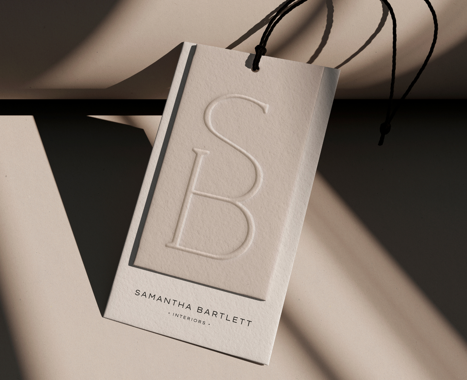
Branding for Samantha Bartlett Interiors, by The Brand Muse
Warm Minimalism: From Visual Clutter to Refined Clarity
Minimalism isn't new, but it's evolved. The cold, stark minimalism of the early 2020s is giving way to something warmer, more human. Think stripped-back spaces with intentionality rather than austerity. Cream, soft greys, warm whites. A few beautifully chosen objects instead of many. Texture and warmth matter; coldness doesn't.
For your brand, this translates directly into visual identity strategy. If cold, minimal branding made sense in 2022; stark sans-serifs, high contrast, lots of white space, it's starting to feel dated. The brands that feel current and human right now are those with refined, stripped-back identities that still feel warm and approachable.
Think about your colour palette. Are you using a palette that's warm and considered, or are you defaulting to the corporate blacks, beige and greys that feel impersonal? Your typography, is it so minimal it's lost character, or does it have personality without being loud? Your imagery, does it feel curated and intentional, or scattered?
Warm minimalism in branding means every element you choose earns its place. Your visual identity shouldn't feel like something is missing; it should feel like you've been thoughtful about what matters and removed what doesn't. That's the aesthetic translation of how your ideal clients want their spaces to feel, and it's how they want to experience your brand, too.
Blue Returns: Strategic Colour Refresh Opportunities
Blue is back in a significant way in 2026, but not the corporate blue of the 2010s. We're seeing cobalts, deep teals, and icy blues emerging as confident, contemporary palette choices. These aren't accent colours; they're strong enough to anchor a whole scheme.
If your brand colour has been the same for five years, this is worth reconsidering. Not because trends change, but because colour perception shifts. A blue that felt fresh in 2020 might feel dated now. If you've been hesitant about introducing colour into your brand because you worried it would date quickly, the 2026 trends suggest that confident, considered colour choices actually age better than playing it safe with neutrals.This isn't about chasing trends recklessly. It's about recognising that if your brand palette currently skews monochromatic or relies heavily on greys and blacks, there's an opportunity to introduce a considered colour that signals you're current and confident. A cobalt or teal introduced as a strategic secondary colour, not everywhere, but in the right places, can completely shift how contemporary your brand feels.
More importantly, it signals something to your ideal clients. A designer or architect using sophisticated colour in their own branding is more likely to use it confidently in their client projects. It's a visual signal of creative conviction.
Deeper Browns and Earths: Grounded, Sophisticated Palettes
At the same time, earthy, grounded tones are moving deeper and richer. Not the beige of minimalism, but warm browns, terracotta, ochre, and warm greys with earth undertones. These feel more sophisticated and more intentional than the neutral palettes of recent years.
For many interior design practices, this is genuinely good news for branding. Earth-toned palettes, when chosen well, feel warm, sophisticated, and human. They communicate that you're connected to materiality and craft. They're also more forgiving to work with than stark palettes. A carefully chosen brown or warm terracotta can make a brand feel established and grounded without trying too hard.
If your current brand palette relies on cool greys or bright whites, consider whether a warmer, earthier direction might better reflect the work you're actually doing and the clients you want to attract. This is especially true if you're working with natural materials, sustainable practices, or residential interiors. The colour story of your brand should echo the material story of your work.
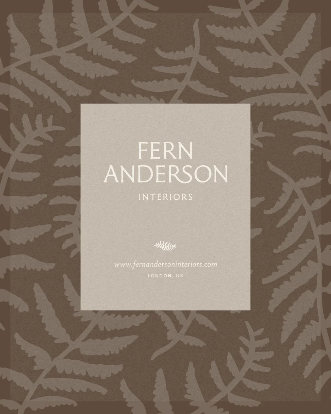
A warm, nature-inspired colour palette for Fern Anderson Interiors, designed by The Brand Muse
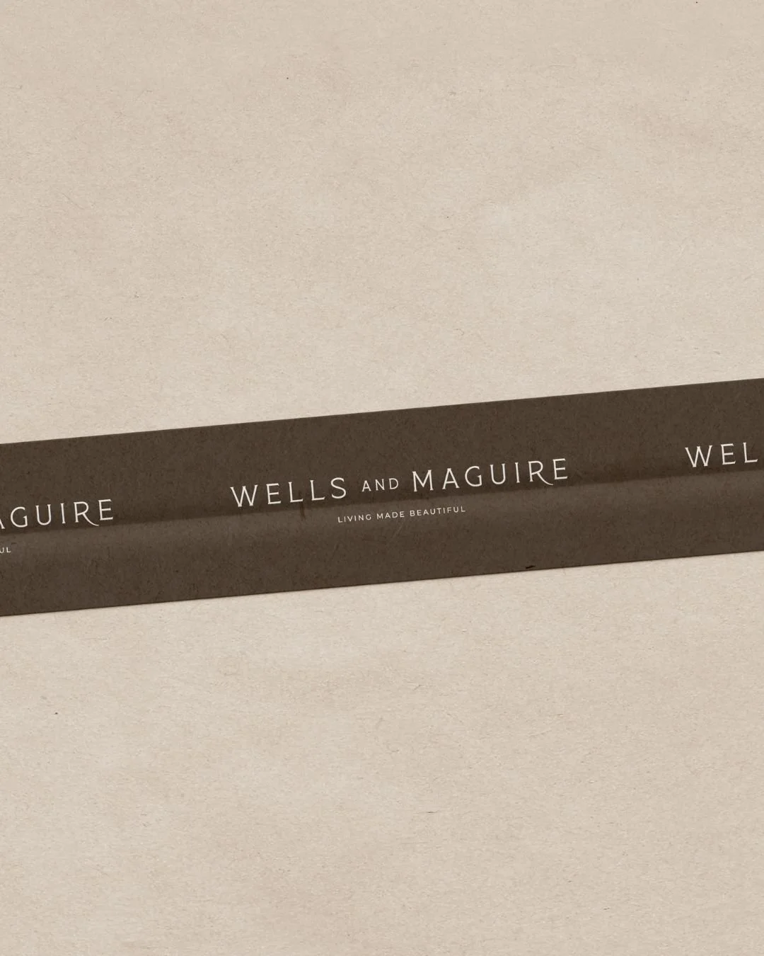
Earthy concepts proposed to Wells & Maguire, designed and prototyped by The Brand Muse
Textural Textiles and Natural Materials: Tactile Brand Touchpoints
Interiors in 2026 are all about feeling as much as seeing. Raw linens, handwoven textiles, tactile surfaces, natural materials with visible texture and variation. The trend is moving away from perfect, uniform finishes toward surfaces with character and history. This isn't about shabbiness; it's about authenticity and craftsmanship.
What does this mean for your brand? It's about thinking beyond what your brand looks like on a screen. How does it feel? What are the tactile touchpoints you create for your clients?
This might mean reconsidering your printed collateral. Are you printing on standard, uniform stock? There's an opportunity to work with textured papers, uncoated finishes, or specialty stocks that have a handmade quality. Embossing, blind stamping, or other finishing techniques add tactile dimension. Even small touches; a business card that feels good in your hand, a proposal printed on thoughtful paper, packaging for deliverables that reflects your aesthetic, communicate something important.
If you're giving clients physical samples or mood boards, what are they printed on? What do they feel like? In a world where everything is digital, the tactile quality of your physical brand assets becomes more meaningful, not less. A brand that only exists on screens starts to feel thin. A brand that exists in print with intention and craft feels substantial and real.
Pattern and Colour Drenching: Consistency Across Every Touchpoint
We're also seeing a return to pattern in interiors, and to colour schemes that feel more saturated and intentional. Spaces are being decorated with more confidence. Pattern mixing is back, but it's done with consideration and consistency. Colours aren't tentative; they're committed.
For your brand, this speaks to consistency across every single touchpoint. Your Instagram feed, your website, your proposals, your email signature, your business cards, your social media, do they all feel cohesive? Or are they a hodgepodge of decisions made at different times by different people?
The brands that feel current and strong right now are those where every touchpoint reflects a clear, consistent aesthetic. The colour palette is the same. The typography is intentional. The photography style is recognisable. The way you use white space, the way you crop images, the way you write captions, all of it reflects a clear point of view.
If your brand is scattered across different platforms feeling like different brands, this is the year to audit and tighten. Consistency isn't boring; it's professional. It's what separates a thoughtful design practice from an amateur one.
Craft and Architectural Detail: Bespoke Typography and Custom Illustration
Hand-finished details, architectural precision, craft-based design thinking – these are driving the best interiors work in 2026. Nothing feels mass-produced; everything feels intentional. Spaces are being designed with an eye toward how people experience them moment by moment, detail by detail.
This is perhaps the most interesting trend for branding, because it opens the door to custom, bespoke visual elements. If you've been using standard typefaces and stock photography, there's an argument for moving toward custom or curated choices. This doesn't mean you need to commission bespoke typography (though some practices do). It means choosing fonts with real character, working with illustration or custom imagery that reflects your practice's actual aesthetic, or creating visual systems that feel owned and intentional rather than generic.
The strongest brands in 2026 are those that use distinctive typography, custom colour combinations, and unique visual elements that you couldn't just grab from a design template. These elements signal that you've thought deeply about your visual identity and that you're not relying on off-the-shelf solutions. That level of craft and intention communicates something important to potential clients: if you're this thoughtful about your own brand, you'll be equally thoughtful about theirs.
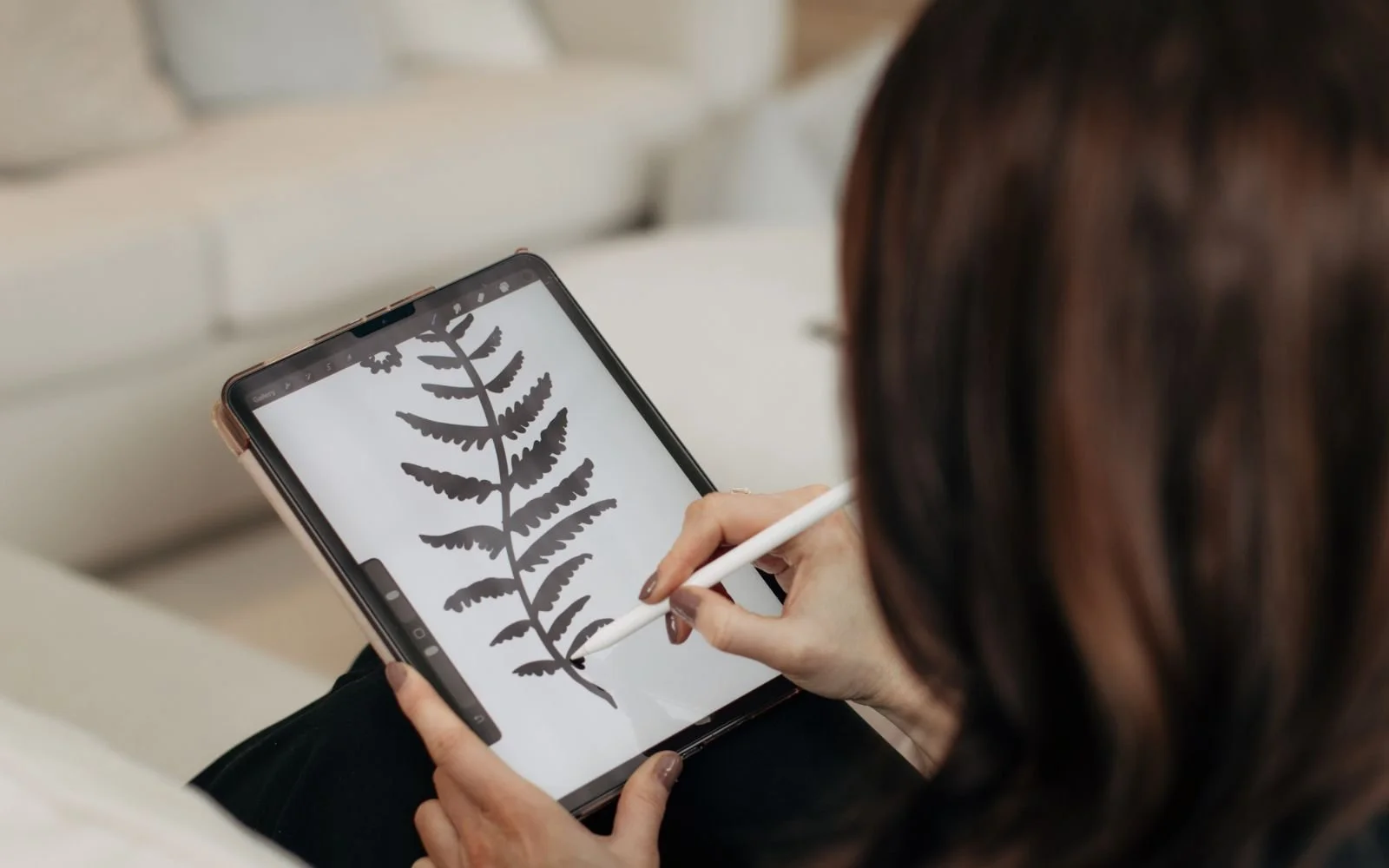
Custom, hand-drawn illustrations for Fern Anderson Interiors by The Brand Muse
Statement Stone and Bold Materiality: Confident Premium Positioning
Materials are having a moment. Statement stones, bold tiles, architectural elements that are meant to be noticed – materials are playing a prominent role in how spaces are designed and experienced. The design thinking is bold and confident, not apologetic.
How does your brand positioning translate this confidence? Are you presenting yourself as premium, or are you positioning on price? Are you confident in the value you offer, or are you trying to be accessible to everyone?The strongest positioning for design practices in 2026 is bold and clear. You know who you serve. You know what you're good at. You're not trying to be everything to everyone. Your brand reflects that confidence. Your pricing reflects it. Your case studies reflect it. Your website copy reflects it. You're not tentative; you're assured.
If your current brand positioning is vague or broad – "we design beautiful spaces for anyone" – or if your pricing is unclear, or if you're trying to appeal to too many different market segments, this trend toward bold materiality suggests a branding approach: get clearer, get more confident, take a stronger point of view.
Indoor-Outdoor Connection: Organic, Breathing Brand Design
The boundaries between inside and outside are blurring in 2026. Ventilation, natural light, connection to landscape, biophilic principles – these are driving design decisions. Spaces feel open, breathable, connected to the natural world.
For your brand, this speaks to something more subtle but equally important: breathing room. Does your brand feel cramped and dense, or does it have space to breathe? Your website – does every pixel feel used, or are there moments of quiet? Your Instagram – do you post constantly, or do you take time between posts to let content land? Your communications – are you always selling, or do you create space for genuine conversation and value-giving?
The brands that feel most luxurious and thoughtful right now are those that know when to be quiet. They don't feel the need to fill every space. They create moments of calm and breathing room, just as the best interiors do. Your brand can do the same. An elegant simplicity, generous white space, thoughtful gaps between communications – these create a sense of abundance rather than scarcity.
What This All Means for Your 2026 Brand Strategy
These trends point toward a consistent direction: brands that are more considered, more confident, more intentional, and more authentic. Brands that take up space without being loud. Brands that feel crafted and thoughtful. Brands that know who they are and don't apologise for it.
If you've been sitting with a brand that no longer feels aligned with the current moment, or more importantly, aligned with who you've become as a practice – 2026 is a good year to consider a refresh. Not an overhaul necessarily, but an evolution. Warmer colour palettes. More thoughtful typography. Clearer positioning. Bolder confidence in what makes you different. More intentionality about every touchpoint.
The interior designers and architects who are doing the best work right now are making decisions from a place of clarity and conviction. Your brand should reflect the same approach. It should feel like it was designed by someone who knows what matters.
If you're curious about how these trends might translate into a brand refresh for your practice, that's exactly what we explore in our discovery process. At The Brand Muse, we understand the intersection of interiors aesthetics and brand strategy – we live in that space, and we help design practices like yours build brands that feel current and confident. Explore our full method and investment in our Investment Guide, and when you're ready, let's talk about what's next for your brand.