

ACE & GRACE
BRAND STRATEGY, VISUAL IDENTITY & FULL LAUNCH CAMPAIGN including photography + videoBuilding a brand, a Shopify store and a season of content for a girls' tenniswear label designed around confidence and belonging.
OVERVIEWAce & Grace is a girls' tenniswear brand founded on a simple observation: when girls feel good in what they wear, they show up differently on court. Where girls' tennis kit had long been an afterthought, either scaled down from boys' sportswear or too loud and impractical, Ace & Grace set out to create pieces designed specifically for girls aged 4 to 10, balancing modesty, comfort and performance with genuine elegance.
We partnered with Ace & Grace from the ground up, taking the brand from an early-stage idea through to a full market launch. The scope covered brand strategy, visual identity, marketing materials, two photoshoots (lifestyle and e-commerce), video content, a custom Shopify website and an ongoing monthly content programme, giving the brand everything it needed to launch with a cohesive, premium presence from day one.

THE APPROACH
Strategy & Visual IdentityWe refined Ace & Grace's mission, values and positioning, mapped the audience of parents, players and coaches, and developed a tone of voice built around storytelling. This strategic foundation shaped a visual identity designed to feel feminine without being childish and playful without losing restraint: a full logo suite, supporting brand marks, a soft considered colour palette and typography that could flex confidently across digital, print and future physical touchpoints.
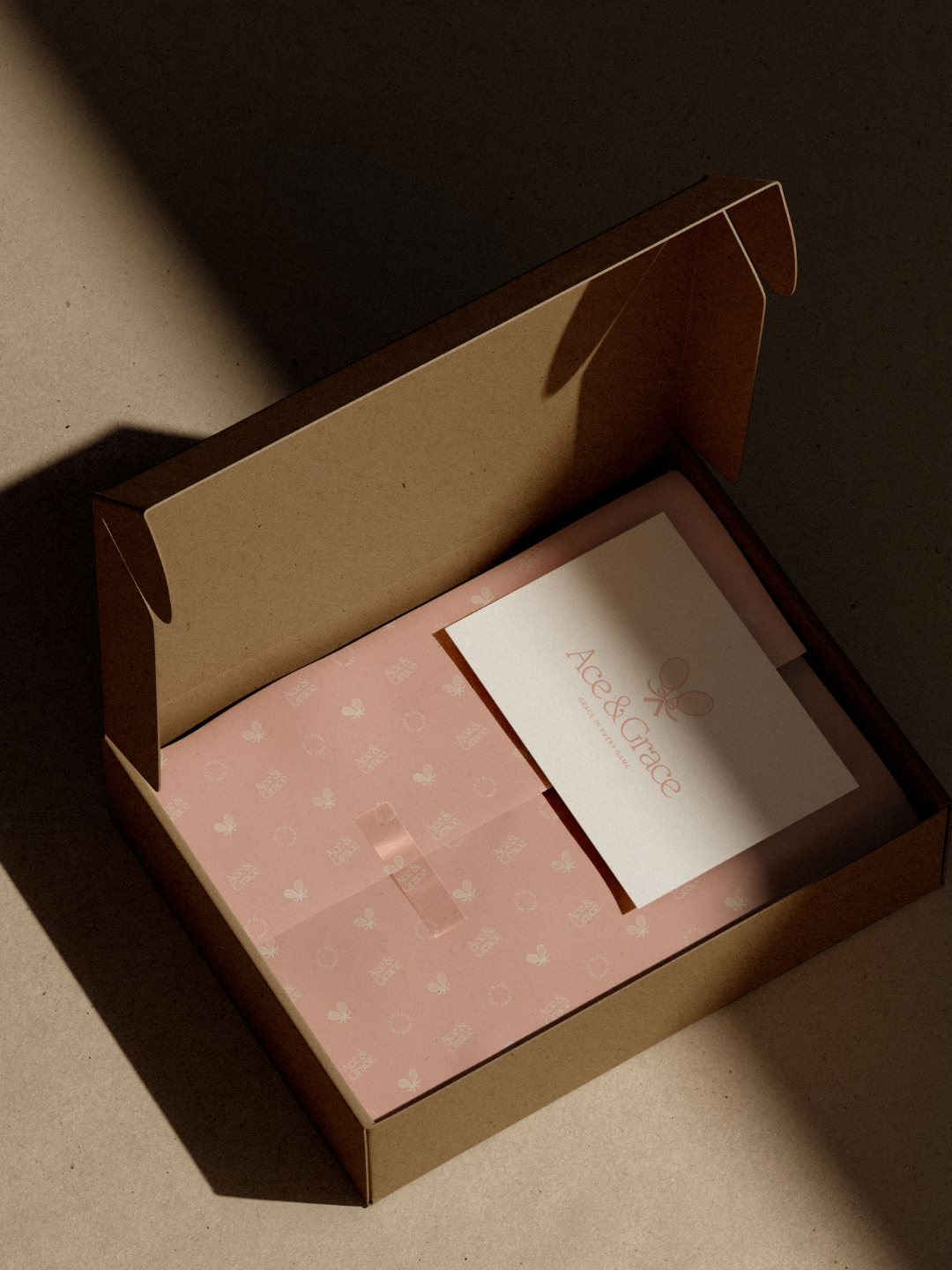
Marketing MaterialsThe identity was carried through to every physical touchpoint a parent or child would encounter on unboxing, including packaging design, a double-sided thank you card, swing tags, clothing label and embroidery guidance, and a "First Serve" initiative card to extend the brand's storytelling beyond the garment itself.
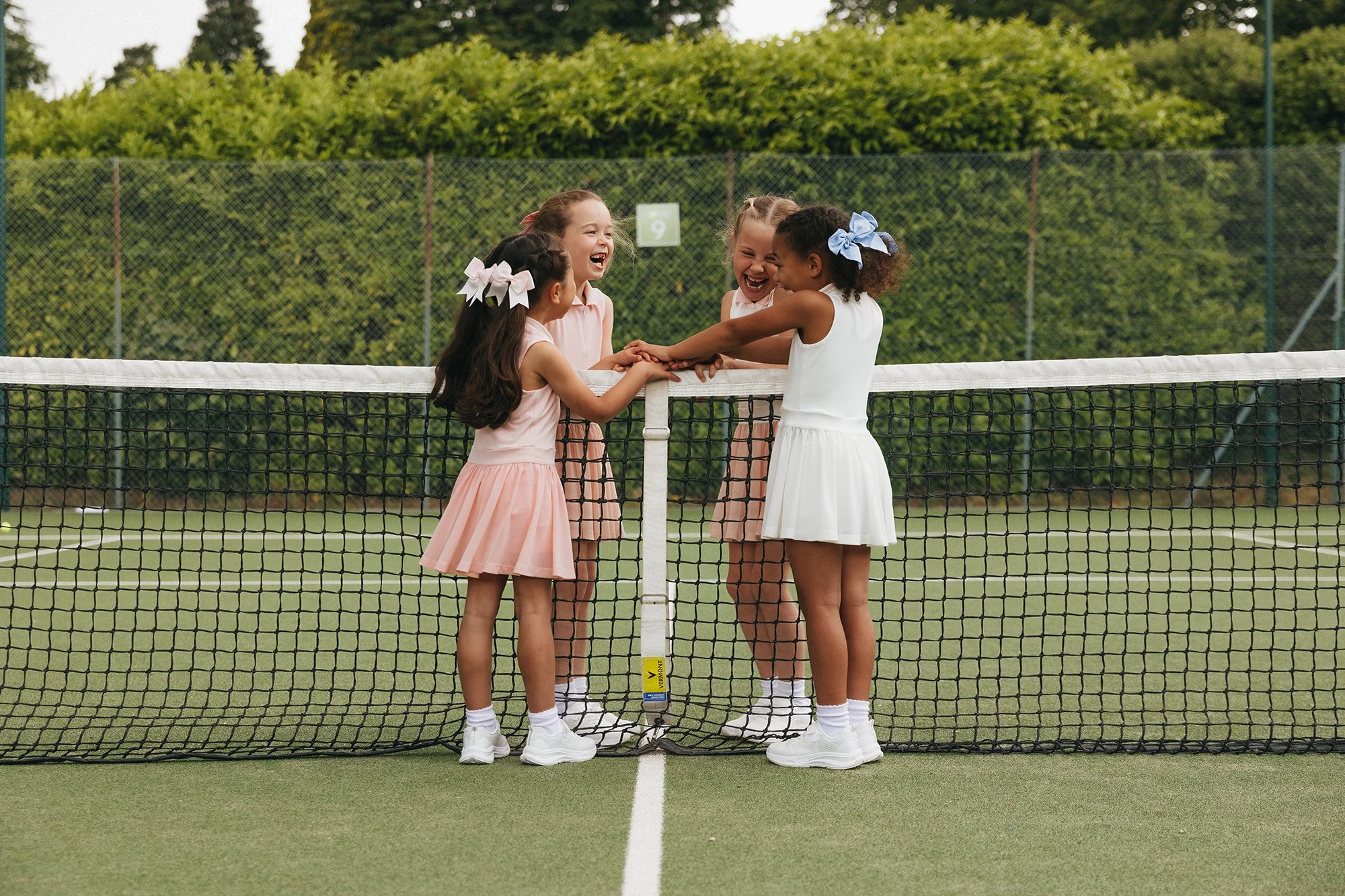
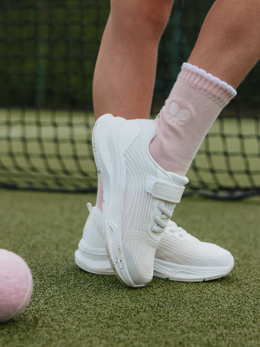
Creative Direction & PhotographyThe strategy was translated visually through a campaign concept built around the most recognisable symbol in the sport: the net. Rather than a divider, we treated it as a connector, framed against a colour story of cream and soft blush set against the green of the court. This concept shaped a full-day lifestyle shoot on location at a tennis club, to capture the brand's warmth and movement, alongside a separate e-commerce studio shoot with consistent framing and a neutral backdrop for a clean, premium product presentation. The lifestyle shoot alone produced over two hundred final assets, delivered despite an unmistakably wet morning that we styled around without losing the brief.
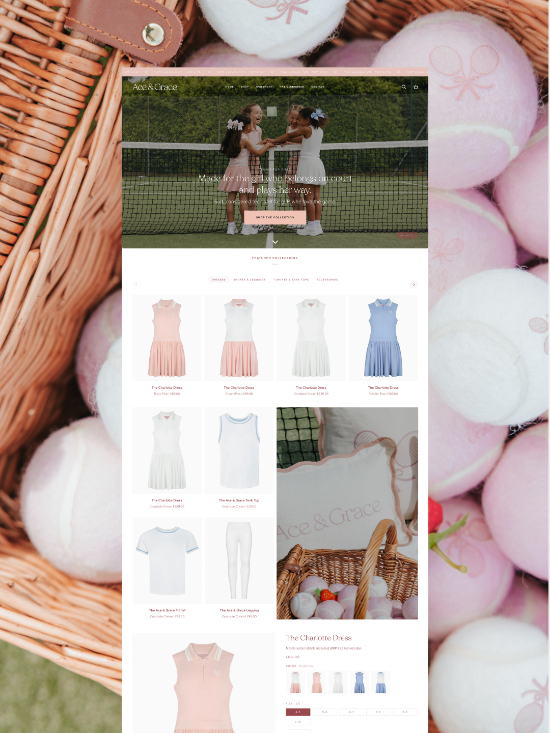
Website & CopywritingWe designed and built a custom Shopify store spanning homepage, about, collections, product and blog pages, with a tailored children's sizing guide, parent-friendly FAQs, and copywriting throughout that tells the Ace & Grace story while staying optimised for the way parents actually search for girls' tenniswear, with segmented email automations wired into the launch sequence.
You can check out the Ace and Grace website now!
Launch ContentTo carry momentum beyond launch day, we developed a structured monthly content programme, including social content, email campaigns and SEO-focused blog posts, giving Ace & Grace a consistent voice and visual presence as the brand continues to grow.

THE OUTCOME
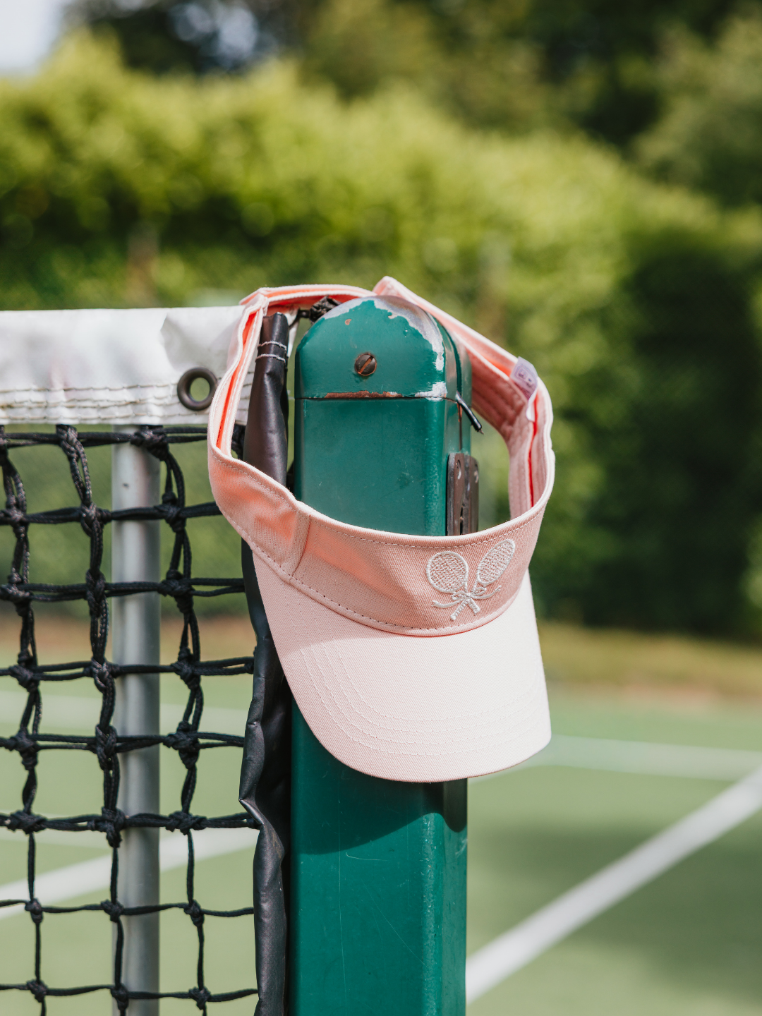
Ace & Grace is now live: a considered brand identity, a launch campaign built around belonging rather than competition, and a converting Shopify store backed by segmented email automations. The partnership continues, with monthly content supporting Ace & Grace as it builds a trusted place in girls' tennis.
INSPIRED BY THIS PROJECT?Explore how we approach brand strategy, digital and creative direction.