
Everyone copies the Studio McGee look. Almost nobody copies the decision behind it.
A brand marketing case study on fonts, colour psychology, audience, and the revenue split most people never ask about.
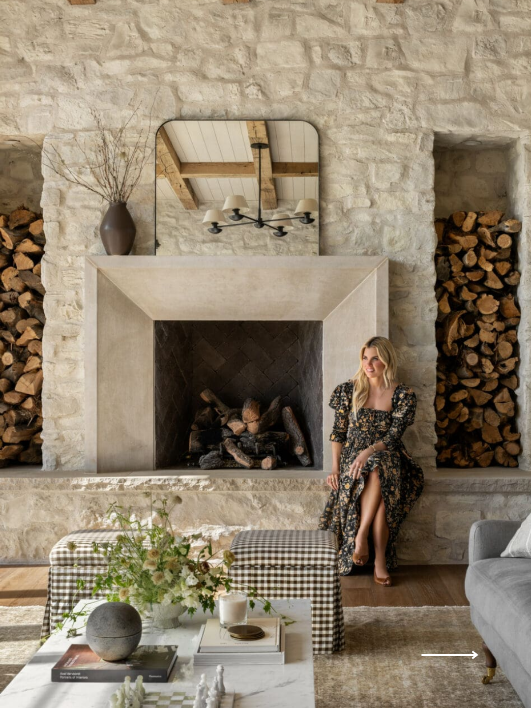
Studio McGee is one of the most screenshotted interiors brands in the world. Warm, neutral, unmistakably "them," copied constantly by studios who want the same feeling in their own feed. What gets copied is almost always the aesthetic. What gets skipped is the decision-making underneath it, and that's the more useful thing to study.
We pulled this apart the way we'd pull apart any client's brand: fonts, colour, audience, tone, creative direction, and the business model sitting quietly behind all of it. Ten years in, a lot of it turns out to be deliberate.
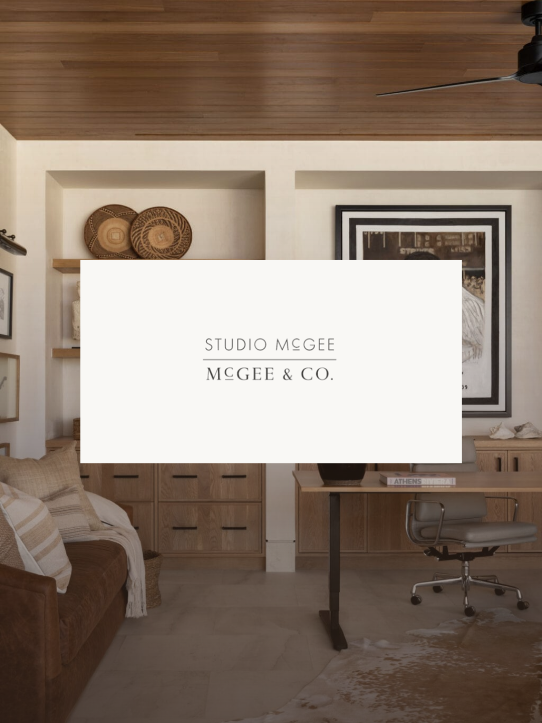
Two Fonts, Two JobsStudio McGee, the design service, runs on a custom licensed typeface. It's used sparingly as a clean, sans-serif register for navigation, and it shifts into an elegant, editorial italic for headlines and pull quotes. It reads like a magazine, because that's the job it's doing: signalling authority and taste.
McGee & Co, the product line, runs on a completely different typeface, a widely available, modern sans-serif built for one thing: legibility at speed. Product names, prices and checkout copy don't need to feel editorial. They need to be easy to scan and easy to buy.
Same company, two typographic systems, because the two sides of the business are solving two different problems. That's a decision, not an accident, and it's one most small studios never make consciously. They pick one typeface for everything and ask it to do two incompatible jobs at once.
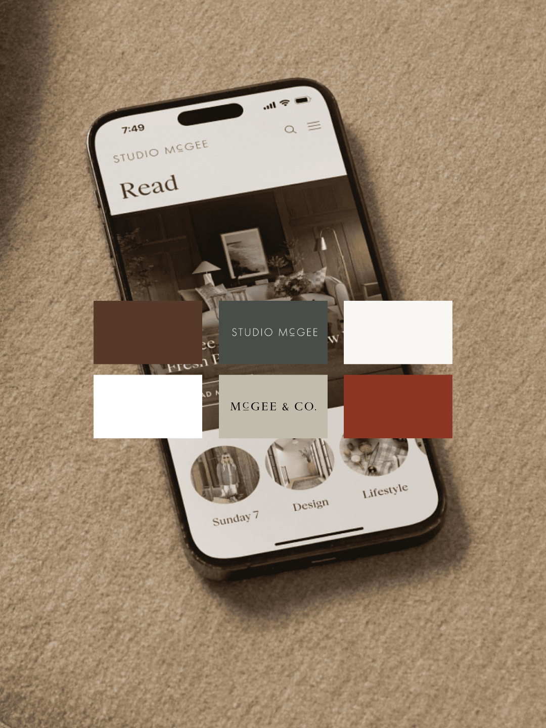
A Palette With No Trend Risk In ItLook across a decade of Studio McGee's output and you won't find a single saturated colour. The core palette is warm ivory, muted sage, soft warm grey, and a deep, warm brown, the same family of tones they've now formally named their "New Heritage" palette: soft taupes, creamy whites, muted browns, with navy, forest green and aged brass used sparingly as accents.
There's a psychological logic to it. Browns and woods read as crafted and permanent. Muted greens read as calm and organic rather than corporate. Warm off-whites read as considered and lived-in, not sterile. None of it is trend-led, and that's the point: a palette built from trend colours dates within a couple of years and forces a visual refresh to stay relevant. A palette built from warm neutrals can run for a decade without looking tired, which is exactly what's happened here.
The result is a collection where every detail is a decision.
The Audience Was Named Before The Aesthetic In interviews, Shea and Syd McGee have described their customer specifically: women in their twenties through mid-forties, either buying their first home or building the one they'll stay in, looking to Studio McGee for guidance rather than arriving with a finished vision of their own. That single sentence does more work than most brand strategy decks. Every typeface choice, every colour, every piece of content answers to it. Nothing here is decoration for its own sake, it's all targeting a specific person at a specific life stage. Worth being precise about who this lesson is actually for: that's Studio McGee's end customer, not necessarily the audience a studio reading this case study should be chasing. The transferable lesson isn't "target this demographic," it's "name your customer this specifically before you touch a font or a colour."
Tone: Personal, Not CorporateShea has spoken about rejecting what she calls the old, corporate model of design, where firms stay vague about their process and their opinions. Studio McGee did the opposite from day one: narrating decisions in real time, explaining the reasoning behind a room rather than only showing the finished photograph.
For most of the brand's history that voice has been personal and founder-fronted rather than institutional. Familiarity, not polish, built the trust. That's a genuinely different strategy to the one most premium service brands run, where distance and mystique are treated as part of the value.
One Person, Every DecisionEvery product, every project and most of the content has passed through a single creative director for over a decade. Shea holds that role formally as Chief Creative Officer, and it's cited repeatedly, by former employees and by outside case studies, as the reason the brand has stayed coherent while expanding into books, television, licensing and a Netflix series.
A single point of creative control isn't a bottleneck when the goal is consistency. It's the mechanism that makes consistency possible at all. The moment creative decisions get distributed across a growing team without a clear filter, coherence is usually the first thing to slip.
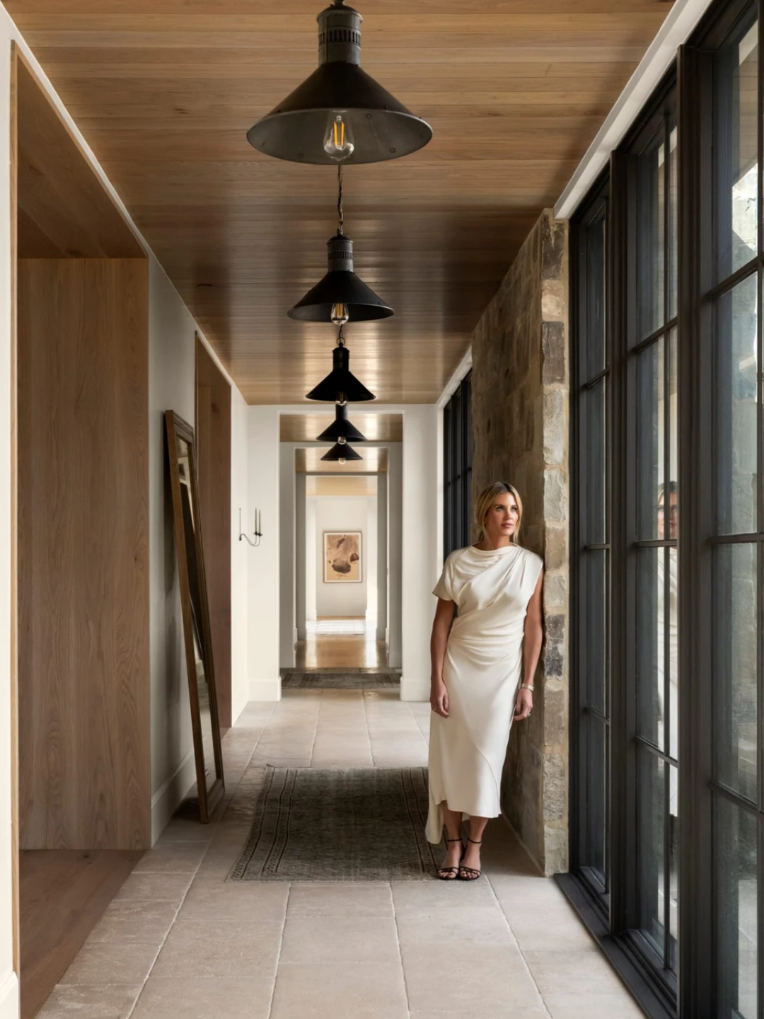
The Brand Changed Its Name Before It Changed Its BusinessHere's the detail most retrospectives skip. A former Studio McGee Director of Design Operations has described the business starting life under a different name, tied to Shea alone, before becoming "Studio McGee" once Syd joined as a full business partner. We haven't been able to pin an exact year for that shift, Studio McGee's own current site frames 2014 as the joint founding date with both of them from day one, so there's a discrepancy between the official narrative and a first-hand recollection that we're flagging rather than resolving. The detail matters regardless of the exact date: the rename tracked a real structural change in the business, from one woman's design blog to a two-person company built to scale.
The Real Rebrand Happened At Year TenThe identity has evolved more than once. Around 2019 and 2020, the studio refreshed its visual identity and website to coincide with the launch of their Netflix series, under the aesthetic name "Traditional Minimalism."
The bigger moment came in 2024, their tenth year in business. They rebuilt the website with agency Made by Six, and separately ran a twenty-one-month PR repositioning campaign with Nylon Consulting. The brief behind both was explicit: stop letting Netflix and their Target partnership define the narrative, and get positioned as a serious American design house in its own right. The PR campaign alone delivered 353 media placements in outlets including Elle Décor, Architectural Digest and House Beautiful.
In May 2025, they formalised their design philosophy into a named aesthetic, "New Heritage," publishing a field guide covering colour, texture, silhouette, styling and layout. That's not a visual rebrand so much as a studio putting language around a look they'd already been building for years, which is its own useful lesson: sometimes the work is done, and what's missing is simply the vocabulary to describe it back to your audience.
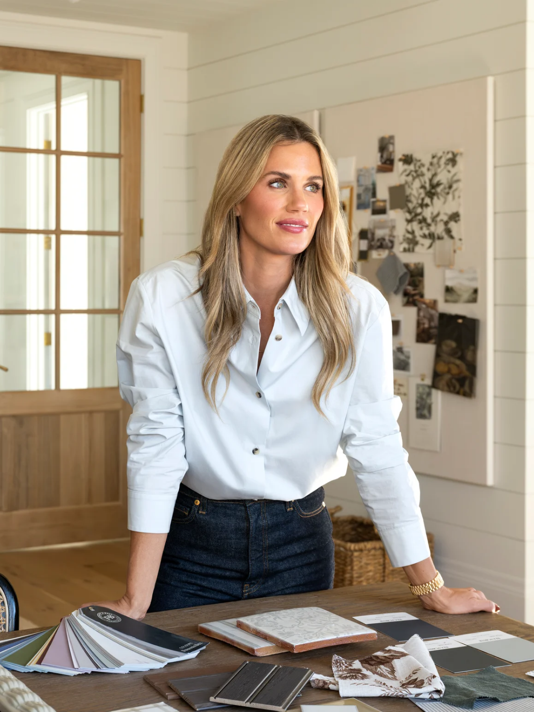
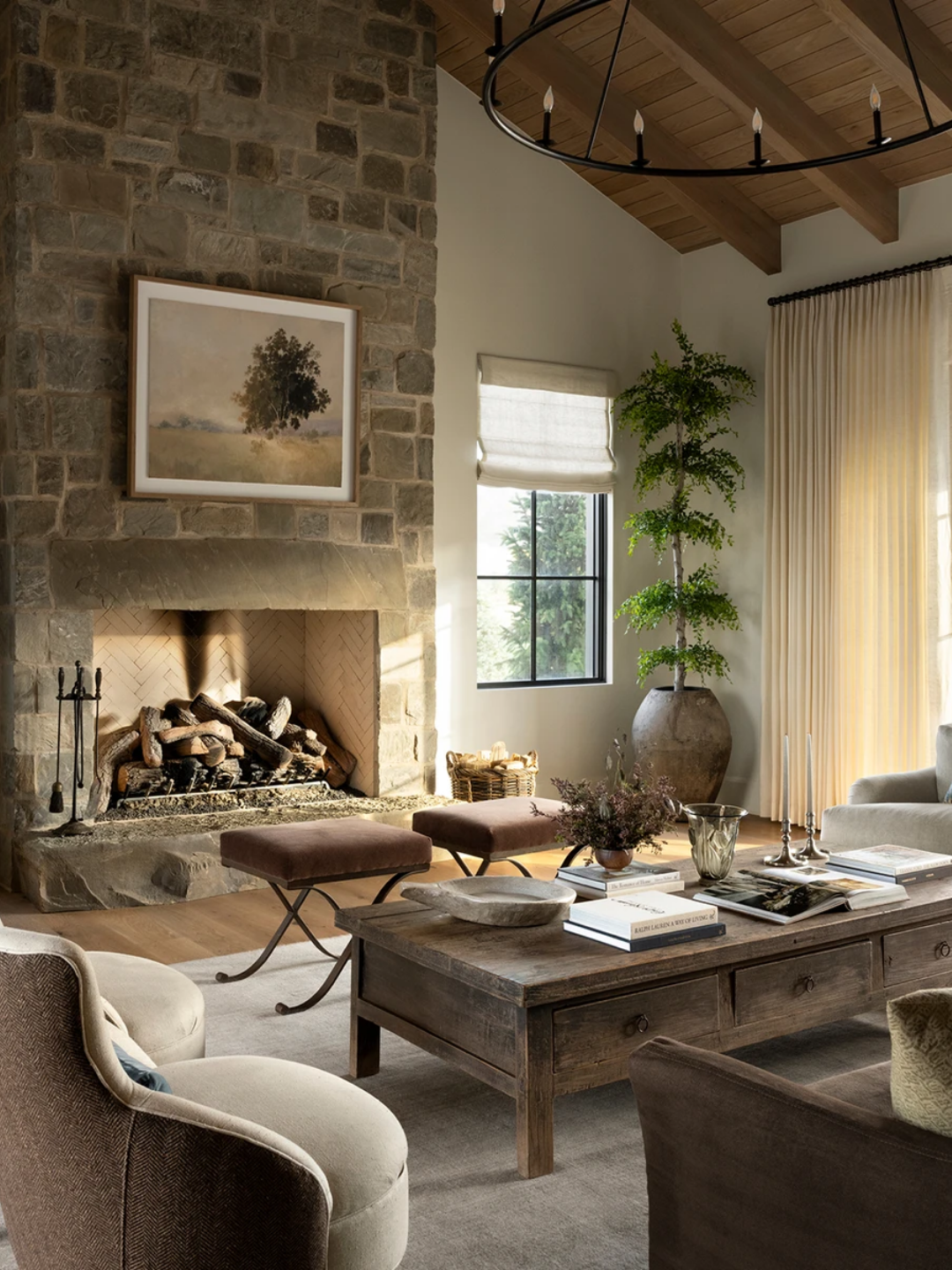
The Revenue Split Nobody Talks AboutThis is the sharpest number in the whole case study. As of 2020, 85% of Studio McGee's revenue came from product sales through McGee & Co, 10% from licensing, and only 5% from the interior design service that the brand is named after.
The design studio isn't run as its own profit centre. It's the content engine for the product line. Every client project gets photographed and published specifically to sell McGee & Co pieces in context, styled in a real room rather than shot on a white background. That's the inverse of how most interior designers structure their business, where the service is the profit and the portfolio is unpaid marketing.
It's a genuinely smart model, and it's not a template to lift wholesale. It only works if a studio is willing to treat its highest-value creative work as marketing collateral for something else it sells. For a service-only studio with no product line behind it, copying the aesthetic without that underlying economic structure just means recreating someone else's brand with none of their revenue behind it.
Make Life Beautiful: A Strapline That Actually WorksThe mission was set in 2014 and hasn't moved. It's still the single stated purpose on Studio McGee's About page today, and it was the title of Shea's first book. A former employee has credited its longevity directly to alignment: the tagline, the aesthetic, the way Shea presents herself publicly and the way she's said to actually live, all point in the same direction. That concordance, not the phrase itself, is what makes it trustworthy rather than decorative.
It's a reminder that a strapline only earns its place if it's operationalised, turned into content categories, book titles, the language used internally, rather than sitting under a logo doing nothing.
What This Means For Your BrandNone of this is really a story about taste. It's a story about a business that made a series of specific, deliberate decisions, typography, colour, audience, ownership of creative direction, and a genuinely unconventional revenue structure, and then stayed consistent with all of them for a decade.
That's the actual argument for strategy before logo. The look is the visible 10%. The other 90% is a set of decisions most studios never make explicit, which is exactly why so many end up with a beautiful feed and no clear reason a client should choose them over the studio next door with an equally beautiful feed.
If you're building or rebuilding your own brand, the useful question isn't "how do I get that look." It's "what is my version of the 85%," the deliberate, unglamorous decision sitting underneath the parts everyone can see.